Stanford Food
To-Go Mobile App Redesign
Critique of the Current Design
01. Overall Design
There are inconsistencies in the design. For example, if you look at the button on the second screen and the button on the third screen, the fill color of the button is different even though the background and font color are the same. In addition to this, the colors don’t work very well together (white font on the light background at top of the page makes it hard to read), which adds to the overall unattractive interface throughout the entire app.
The functionality is decent, but there could be a button that allowed users to directly switch between the login and sign-up page without having to navigate back to the welcome page.
02. Home Page/Sidebar Menu
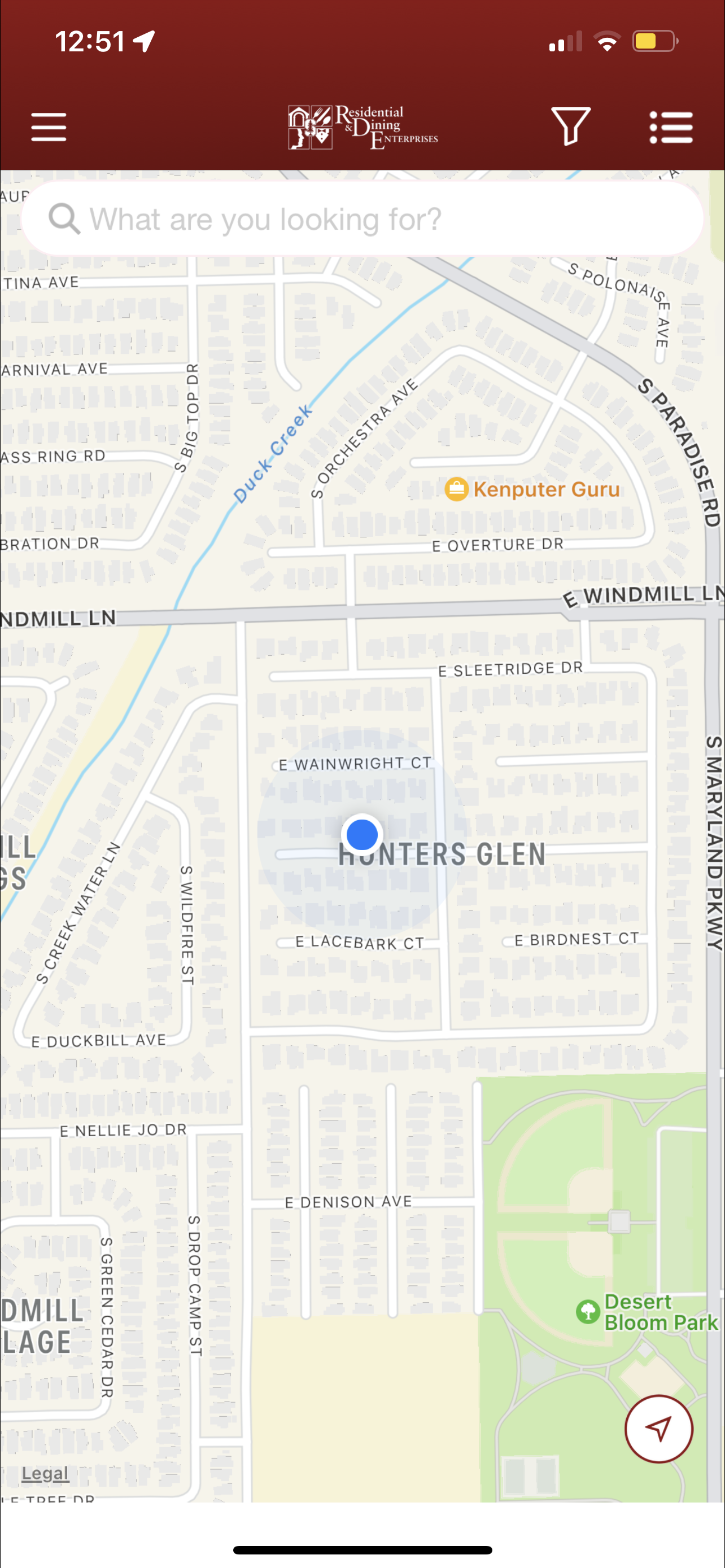
The home page is very bland and doesn’t allow much interaction or exploration of food options. Normally, there would just be a list of all restaurants that fit within the filters selected, but the first screen is blank since I’m away from campus (a problem that I will discuss in the next section).
As for the sidebar menu, its design doesn’t allow easy navigation between different sections. Demonstrated in the video is an example of how a user would have to completely exit a section in order to get to another one.
03. Location
The problem stated above is rooted in the way that the location page is set up. If you’re not on campus, there is no option that allows you to change your location to see what restaurants are available. Consequently, the home page isn’t updated with any restaurants.
The Redesign
01. Onboarding and Sign In
I’ve redesigned the welcome page to have a friendlier and cleaner appearance. I’ve also added a feature that allows users to directly and easily navigate between the sign in and login pages. Users have the option of signing up with email, Facebook, Google, or Apple.
02. Location Settings
Now, you can edit your address no matter where you are, allowing you to explore options even if you’re off campus. You can also save and edit a list of your most used locations so that you don’t have to manually type it in each time you make an order.
03. Home Page
The home page now lists food categories and lists of restaurants so that the user can explore all of their food options. Under each restaurant, there is an estimated time for delivery, the distance to its location, a short description of the food that they provide, and a rating of up to five stars based on customer feedback.
As for the filter tab, I’ve also added a price filter that ranges from one dollar sign to four dollar signs and a ratings filter that ranges from one star to five stars. Other features that I would add include a distance filter and a estimated time filter.
04. Navigation
At the bottom of the screen is a navigation bar so that users can easily travel between different pages of the app without having to completely exit another. This navigation bar features a home page, favorites page, orders page, and profile page.
The orders page tracks all previous and current orders and also includes a “saved for later” tab.
The favorites page allows users to quickly navigate to their favorite restaurants or favorite meals that they’ve ordered.
The profile page allows users to edit personal information and includes a payments, settings, help, and log out option.
05. Ordering
After selecting the desired restaurant, the user has the option of delivery or pickup (located at the top right corner). Each restaurant’s page includes includes customer ratings, distance to its location, estimated time of delivery, reviews, deals, and its menu.
To add to your cart, simply tap on the desired item and customize your order.
Before checking out, review your order in the “My Cart” page.
On the checkout page, users can choose to either pickup their food or have it delivered, change their payment method, apply discounts, and review the cost of their order.
After placing an order, you will be assigned a delivery person, who you can contact through message or calling. This screen also keeps the user updated on the state of their order.


